Holland & Knight
Visual identity expansion and system design
- Role
- Visual identity and system design
- Mandate
- Expand an established identity without sacrificing the firm’s clarity and credibility
- Scale
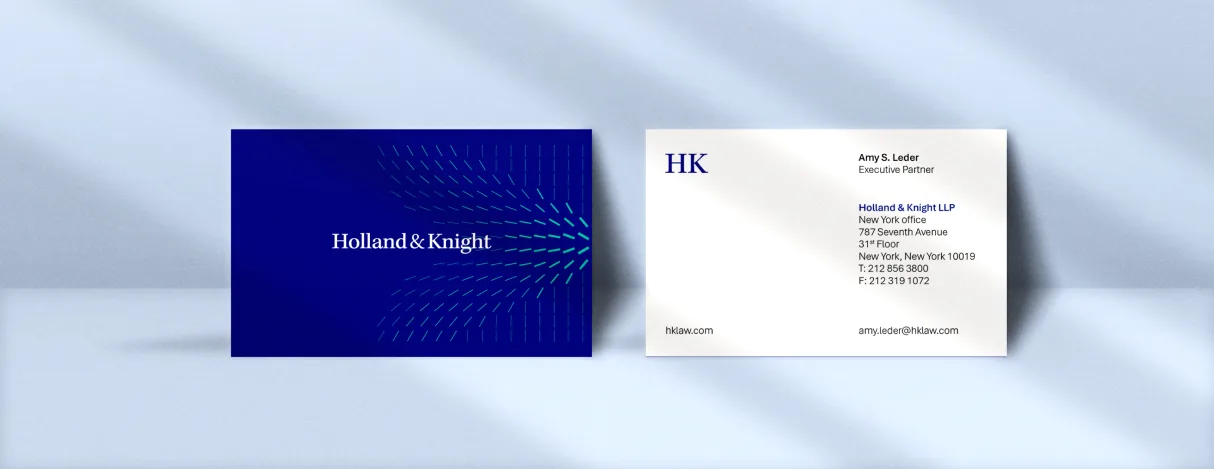
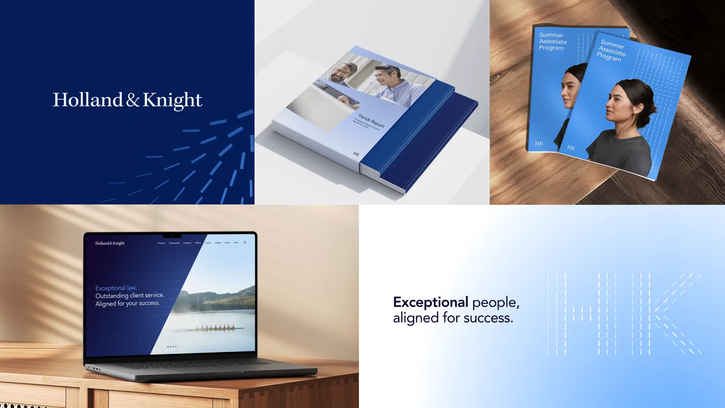
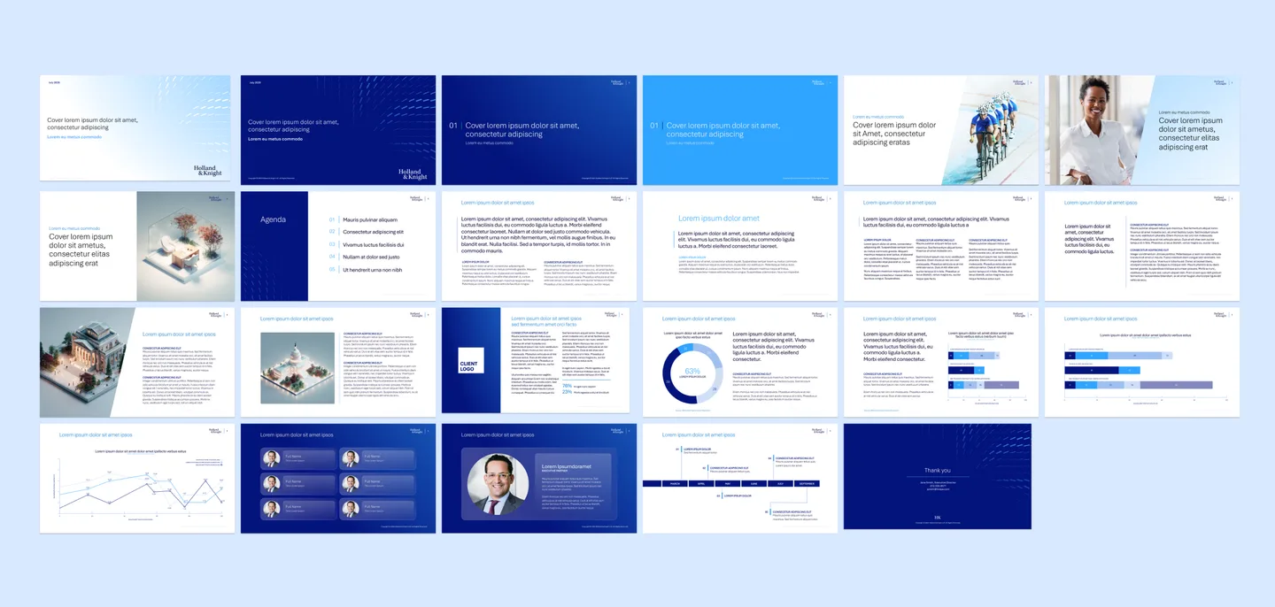
- Print, digital, presentations, publications, stationery, and promotional applications
- Outcome
- Created a coherent foundation for both formal and expressive brand applications
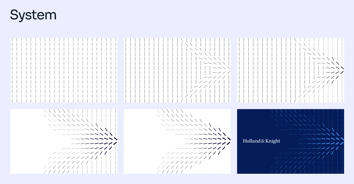
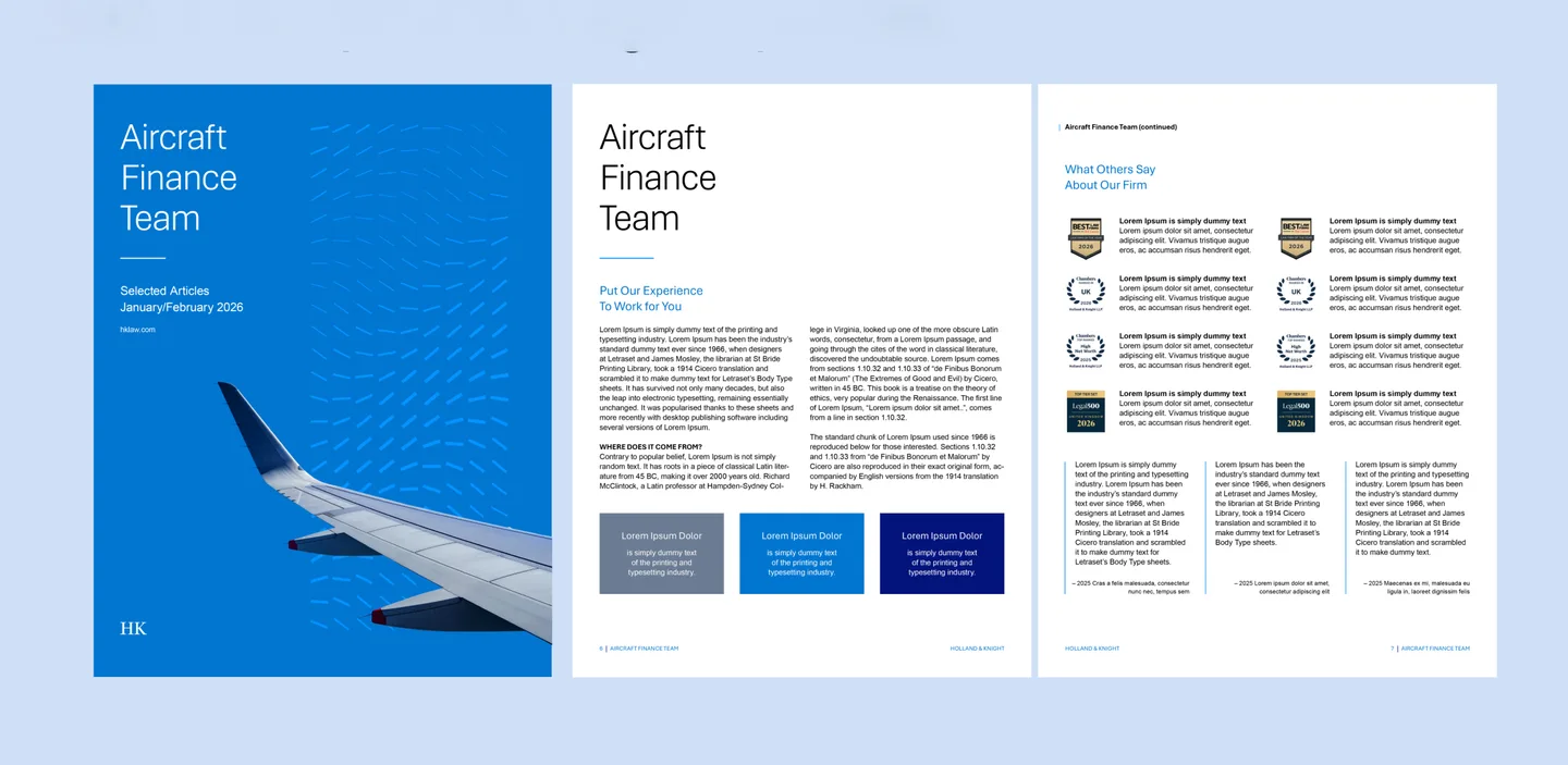
For Holland & Knight, I developed a flexible visual system around the firm’s established logo and wordmark. A new radiating-line pattern, expanded color palette, typography, photography direction, and layout principles gave the identity greater distinction while preserving the clarity and credibility expected of a global law firm.
I translated the system into the tools people used every day—design exhibits, presentations, advertising, digital and social communications, newsletters, invitations, stationery, and promotional materials—creating a coherent foundation for both formal and expressive applications.